We are currently working on an adorable mid-century home with literally one of the least functional kitchens I have ever seen. Enter, new dream kitchen. Check out what this couple is currently dealing with. The original kitchen just isn’t cutting it any more. A lack of proper storage, a range crammed against a non-functional pantry, and NO dishwasher. Even the drawers aren’t making the cut, they are half the depth of a normal drawers. And to top it all off, this client LOVES to cook. She walked into our presentation meeting today with homemade rice crispy treats with browned butter. Hello! This soon to be momma needs a new space and fast!
The “Original” kitchen of the house. Inadequate pantry, lack of proper drawers, and bad appliance placement.
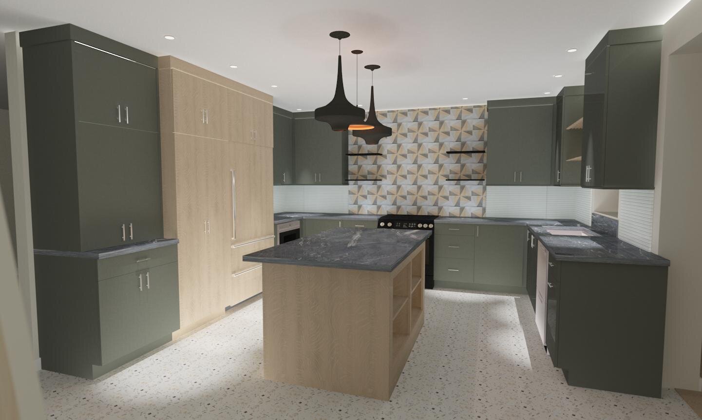
Our design for this new kitchen is inspired by the clients love for a green kitchen. We found the most perfect shade of green, Pewter Green by Sherwin Willams, for their cabinetry. Our vision board is all things modern: a fun cluster of pendant lights in various shapes, clean cabinets, black hardware, luscious soapstone counters, and blend of hand-painted and modern mosaic tiles.
Our vision board- Modern, fashionable, and organic.
Now to build the design. First up, the poor layout. Push that wall back, center the range on the back wall, a Fisher and Paykel integrated fridge and Sharp microwave drawer close to the cooking zone, a Fisher and Paykel dual-dishwasher drawer, and a double trash pullout. Since the floors will be restored terrazzo, we are adding a “furniture style” island in the center. The open cubbies can be styled with cute baskets and baking items- pretty and functional. Lighting was an important part of this design too…a perimeter of recessed 4” cans and a cluster of island pendants. If the budget allows, under-cabinet lighting too!
The new floorplan- centered range, proper pantry, microwave drawer, island with seating, and a cleanup zone by the sink and dishwasher.
The palette was derived from the green. The soapstone, the balance of the white oak, the mosaic tile, and nubby fabric. All evolved from our vision board… Modern, Fashionable, and Organic.
The working palette. Only thing missing is gorgeous handmade tiles. See next image.
The pièce de résistance - the handmade tile behind the range. I love how this tile balances the white oak cabinets, and the existing terrazzo floors.
The design has taken shape beautifully! Some realistic renderings to put it all in perspective and build the vision for the client. The white oak block of cabinets for the pantry and fridge balance the large amount of darker green cabinets and soapstone counters. The Terazzo floors are a perfect light, modern, neutral backdrop for the palette. The shelves over the sink are slatted oak and will be a perfect “living shelf” for herbs and plants. We will be extending the counter on the back of the island for 2 seats. Thin floating shelves by the range hood for functional items in close reach, it also keeps the cabinets more balanced and airy.
We are happy to report our client LOVED her kitchen presentation. We hope you will follow along with the journey of this kitchen, coming Spring 2020. I am calling this one: #BSDProjectGreenDream.
Happy Designing! -Brooke


